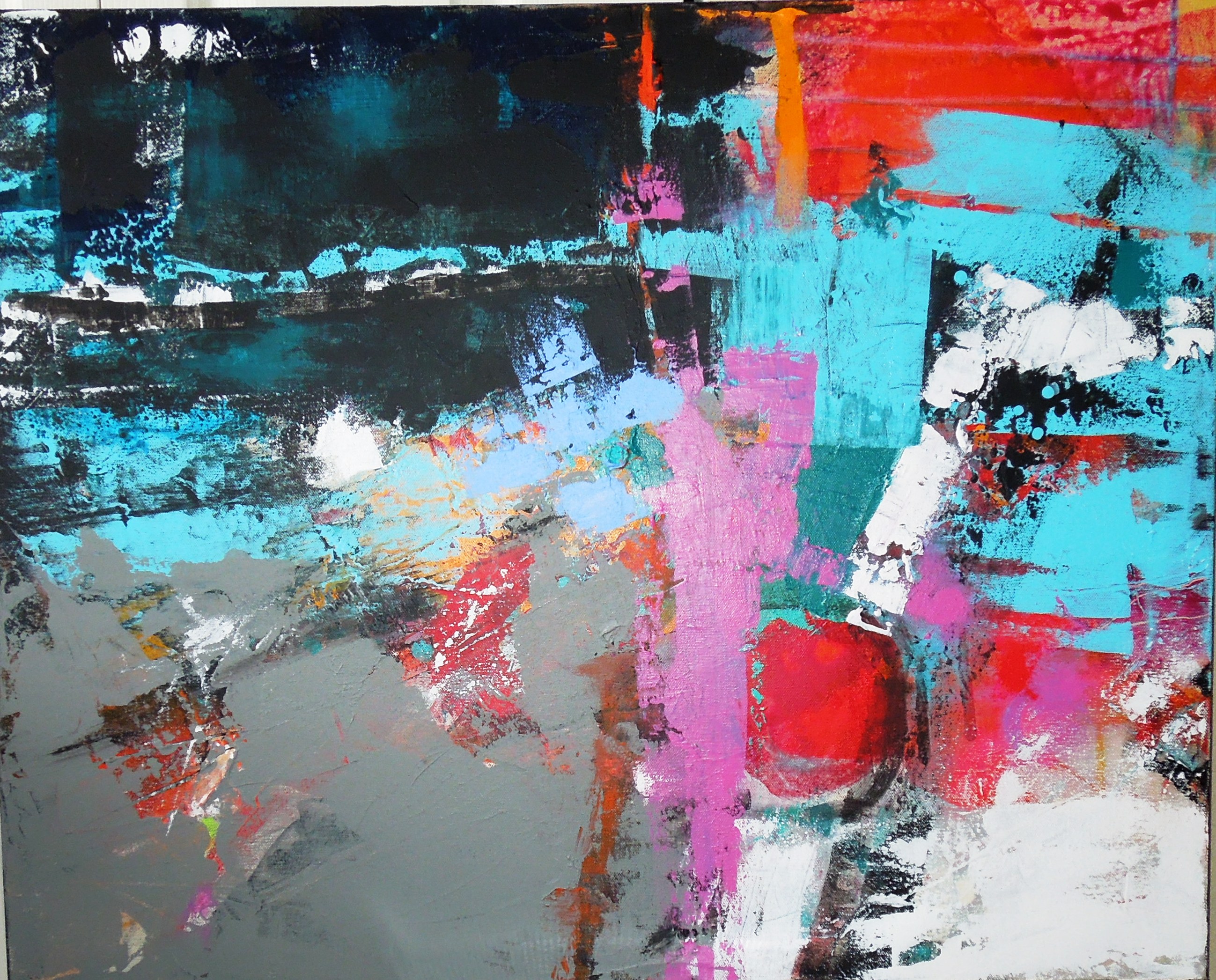
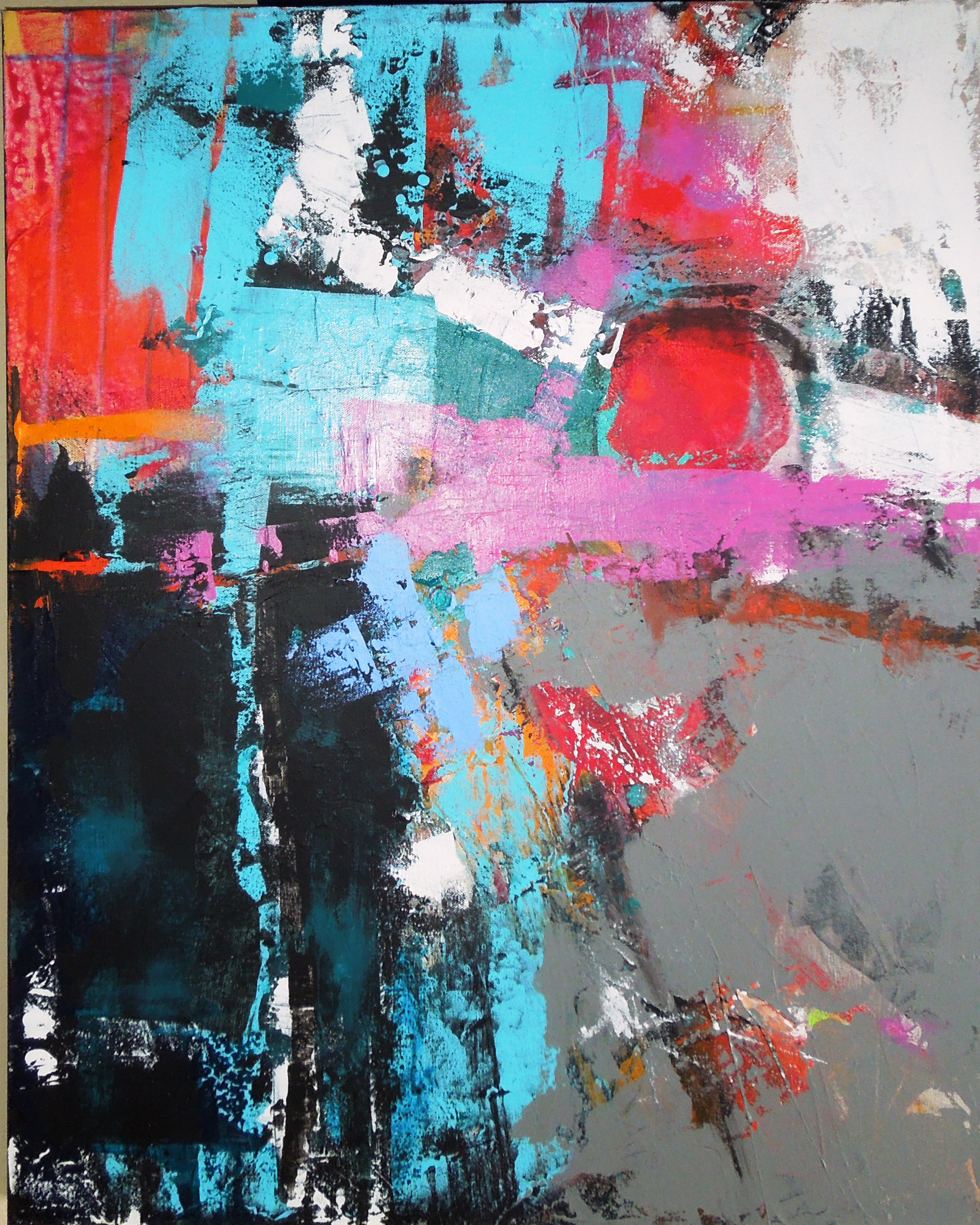
The Year Long Canvas reaches her one-year mark!

?????????? ?????????? 

?????????? ??????????

The Year Long Canvas has had several major changes today, and you can compare them with the previous version below, as well as with the very first start of the original painting from a year ago. I worked the new additions to the composition from all sides today and offered all four orientations of her for your review. You can zzzzzoom in and see her texture – not quite as thick as I had imagined it would be at her first year anniversary.

This project might not be 100% finished at this point. If I look at this painting long enough I will always see something I would like to change…it is a sickness…never being satisfied. But perhaps my fatigue with the entire project will prevent any further work. I cannot say that this newest version is my favorite of all the stages of the past year, but it is certainly among the top three. It has indeed been an exercise in patience, perseverance, dissatisfaction and approval, unease and comfortable-ness with my own work. If the lesson to be learned was that I should trust myself more, that has been accomplished. I was at times discouraged that I would ever be able to make a whole new painting over the top of many other incarnations, but I did it, over and over.

My son says this painting reminds him of RIO – a landscape in other words if it is placed horizontally. It does not remind me of Rio, but it does speak to me of action, energy, optimism and fun. So maybe it is RIO after all! I cannot decide which orientation I prefer…I really do not care at this point. I just like the color, texture and pattern of it, and most definitely color is the thing that grabs people first, then maybe the dramatic composition. The sensuality of color is usually what most people respond to in art and try as I do sometimes I cannot do quiet neutrality. It bores me to tears.

I have had a great year with this project and I hope you have too! Phew…I think we almost made it. Thanks for hangin’ in there!

??????????  newclass 004

Previous version on the left and the very beginning of it last March on the right.

Year Long Canvas, 11/24/2014

YLC1122 003

Year Long Canvas as of 11/24/2014, copyright Jo Ann Brown-Scott

“Let yourself be silently drawn by the stronger pull of what you really love.” – Rumi

Please check my archives if you have no earthly idea what this Year Long Canvas is – painting this canvas is an ongoing project and carries with it quite a story. As you can see, she is back to being horizontally oriented again but you can like her in whatever direction you prefer. If you see a landscape here you are not alone; with nothing else at all done to her, or with a few small tweaks, the landscape idea could become more obvious right now, but it is still too far away from completion for me to settle on a landscape. Call me crazy but I have recently also seen the possibility for people in this composition – not large people, but groups of small people congregating as if waiting for something…in a horizontal row extending from one side to  the other, just along the upper side of the dark stripe that is the new change for this week. They would not be very tall, they would be colorfully dressed and have no distinctive faces. Just waiting.

I always thought that I wanted this painting to be an entirely abstract expression, with nothing recognizable, but I am even rethinking that now. My mind is an open book.

I am definitely learning to better trust myself after all the months of work; to trust my decisions and my judgment, as was one of the original goals for the project, but the other thing that has resulted from doing this, to tell you that truth, is that I have become quite a bit more open-minded about my own work. I accept my own opinions of my own work, which I suppose is one facet of trusting myself after all.

I love painting although I seldom understand it thoroughly. It might come as a surprise for many of you to know that almost every artist does not necessarily like his own work all the time. Many times I have painted a canvas that is not of my own taste. Even within my own paintings I see areas that are not always to my own liking, but sometimes I leave them there anyway, without my own approval. They bother me, they go against my grain and I know that sounds odd, doesn’t it? Well it’s  a strange exercise in intentional imperfection, which I do believe it a useful experience in art. It wakes you up.

The art Buddha understands why I do that, I do believe. He is still smiling and has a twinkle in his eye about this subject.


This We Have Now – New Work by Homare Ikeda

photo 1   photo 5   photo 3

original art courtesy and copyright of Homare Ikeda 2014

This we have now is not imagination. This is not grief or joy. Not a judging state, or an elation, or sadness. Those come and go. This is the presence that doesn’t.  – RUMI, 12th century poet

You have heard me refer to Homare Ikeda in my blog many times (See my Archives) – my esteemed instructor for Advanced Contemporary Painting at Art Students League, Denver. Friday night was his most recent opening titled REVISIT at Wm. Havu Gallery, www.williamhavugallery.com in downtown Denver. The stories told in his paintings are more than magical – they are transcendent. It is not unusual for him to work on a painting for years – sometimes as long as 18 years – revisiting it from time to time, enhancing, subtracting, building layer upon layer in order to evolve the image through the years of its life. These incarnations of art reveal stories of each particular time and place the painting is revisited. That is why and how his art lives, breathes and grows, revealing a language of intricate symbols expressed in whimsical playfulness that provide the artist with a means of conversation, and the art becomes a dialogue between the artist and the paint. How fortunate we are to be offered a glimpse of this personal communication.

http://www.homareikeda.com


Year Long Canvas Project, Week #9 – Risk Taking

her2 Before – some gray wash added in the lower area

??????????  After  – more gray wash and the big gutsy move, copyright 2014


My relationship with the Year Long Canvas (YLC) continues, and she has a mind of her own…so when she speaks to me I listen.

Monday’s class was rather different and fascinating for me.  At the suggestion of my instructor, Homare Ikeda, I reluctantly covered a large portion of the lower portion of the painting with a gray wash. He loves gray washes – he uses them a lot in his own work. In the hallway outside our classroom is hanging about a 4ft x 4 ft Ikeda painting, and there is a large gray square area in the middle of the painting that dominates – obviously at some point he thought the painting would look better and work better and be more balanced if he grayed-out this portion of the composition. I cannot show you a picture of it because I would be violating his copyright, but the remainder of the painting is busy – complicated and playful – with zigzags, polka dots, squiggles and other childlike gestures done in various colors of paint. The gray area is not the focal point – it throws the emphasis to all the outside areas of the painting which are the focal point. Very unorthodox, to do that – but that is typical Homare Ikeda. That is precisely why he is who he is. See his paintings at http://www.homareikeda.com

So, we agreed it was time to simplify, and what has become the focal point and/or the STRENGTH of the painting (the multi-colored busy-ness in the middle area of the right side of the painting) is NOT the place to do that, so it seemed logical to use the wash right where I used it. Painting is often a series of additions and subtractions – you try something on the canvas and either it enhances the painting or it does not. And it might enhance the painting during many hours of work sessions and then suddenly when you do some specific thing to the other parts of the painting, everything changes and the area you enhanced no longer enhances. After cautiously spreading the gray wash over the bottom, I liked it – it made everything else stand out by comparison and it concentrated all the action more effectively on the focal point. So I continued the gray wash farther up the left area of the canvas, covering up even a larger percentage of the canvas with it. The purplish-blue in the upper left was grayed as well. Then I decided I liked the  path of stark white so I whitened it up even more – taking it more prominently from lower left across and over toward the mid-right, which gave the focal area more punch, because the white contrasted so nicely with all the bright colors there.

I was surprising myself – I was going forward with something I thought I would not really like and finding out it made everything better. Gray is not a fav color of mine, but it did what it was supposed to do because it is so neutral. The advantage of gray is that it does not conflict with much. It is merely gray.

So while I was on a roll I decided to create a sort of something-or-other to look THROUGH, right on top and over the surface of the focal point, as if you are seeing all that focal point action behind it  – and instead of doing an obvious window with a square-ish frame I decided to do a series of slanted parallel lines almost suggestive of venetian blinds, right over the top of the focal point – the reason being to give it more importance! Anyone viewing the painting would feel that they were seeing through the lines to a special scene or image – and since it already had a round sort of blurred fried egg shape like a sun, perhaps I was suggesting that the view was of a landscape with a colorful hillside village underneath the sun, seen from behind open venetian  shades. I thought it might give the painting a quirky twist – a mysterious turn of events.

Well it seemed a risk worth talking, so I used turquoise lines in a non-square-ish, somewhat distorted way, and I drew them right on top of my focal point. YIKES YIKES YIKES I kept thinking as I did it – this is either going to be great or it is soooo not going to be great.

When I showed it to Homare he was very, very pleased – big smile. And my work for the day was done.

I would so love to leave the YLC this way and call her done….I would title her “Seeing Puerto Vallarta” …… but that is not the challenge, is it?

Year Long Canvas Project #8


her2 Year Long Canvas Challenge, Week 8, copyright 2014, Jo Ann Brown-Scott – untitled

Time flies when you are having fun – here we are at week 8 – about 44 or so to go. (for you new followers thank you so much for coming aboard, and please refer to my archives for an explanation of the Year Long Canvas Challenge).

And as of now, she has totally lost her original identity. The old “year-long” as we remember her is nearly gone. She is in the witness protection program hoping for an entirely new start.

Yesterday was CRAAAzy. She took off out of the blue and left me in the dust….the canvas I mean. I believe the mood in the classroom was partly responsible – people were laughing and talking as they painted, and some were  actually told to dial it down and be quiet. But see what good energy was unleashed as a result? Silence is over-rated.

She has gotten a life of her own. My head was spinning. I was out of breath, trying to keep up with what she was telling me to do….yelling at me! Commanding me.

She is all up in my face about wanting to be FREE.

She told me that last week’s additions were pretty much OK  but she wants more – she wants to have it all.

Color, line, rhythm, movement, sensuality. Mystery! A message! Is she asking me for calligraphy….???

So what is all that going on in the left-center of the composition? All the shapes, and the dots and the compartments of color and black? Even a couple or three triangular flag shapes….HUH?

I believe it has something to do with the week I have had – a week of LIFE issues, the kind everyone has – and all the compartments I place them in. There was a death, the announcement of a pending birth in the family, a bit of drama I will not go into, a health thing, an amazing dream and even more. I watched a cute kid in the park flying a kite – a flag? I see the whirl of the wind in the composition – and chaos. It is all a big Rorschach image – you see what you want to see. And if you are not seeing anything much at all except bold color, that is also just fine.

So I had fun in class yesterday – my esteemed instructor, Homare Ikeda, likes it and he and I both threw out some suggestions – I tried a couple of them in this newest incarnation and covered one up already. Three steps forward, one back.

It is almost May and I am trying my best to be carefree. So far it seems to be working.

Year Long Canvas Project #7 – Time for a Bold Move

721class  before   orange  after

Yesterday afternoon was gorgeous outside – spring in all of its SPRINGY glory. I wanted to take a walk and go play in the out of doors. But I attended my usual Monday art class. When I arrived I can’t say that I was really into a painting mood, but I know from experience that when your mind is NOT fully engaged and you are thinking about other things, it can actually work to your advantage. You don’t over-think – you don’t question yourself – you have kind of a WTF attitude. That can bring a looser approach and a less contrived work session. But in spite of that mood, class was stimulating, energy sapping and intense – but in a good way. Some students were painting for upcoming shows. Some were painting the same kinds of things they have been painting for months now with little variation. Others were doing fascinating work that I greatly admire. A few were barely painting at all…

In some future post I will talk about the situation in an art class, any art class, which predictably involves some students who aspire to paint as precisely like the instructor as they can – they want to be clones. They do not or cannot bring an original idea or concept to the table. (On second thought I will just leave it at that, because I don’t ever want to make a habit of bashing other people’s work…)

I set up camp. I am working on 3 canvases now at the same time, but the Year Long canvas has gained a reputation and people now know it by name, and they stop by to visit HER each week, checking on progress. I am assigning it a gender now, don’t ask me why. I just don’t like calling the canvas an “IT”. The first photo at the top of this post is how the canvas looked at the mid-point of yesterday’s class, with new work done in several areas. The changes made include the subtle definition of oval shapes in the upper right with a wash of pale peach tones and in the center area I defined 3 oval shapes in the Naples yellow, then another larger oval to the left of that. Why? Because it was time to begin some definition…some type of direction defined by shapes. No, I do not know where I am going with it just yet. Then I whitened up the slash of white that runs from the lower left across the center toward the upper right. I also added more purple tones to the upper left area, overlapped some areas with additional turquoise. I am improvising – abstract expressionism is all about improvisation. The paint does speak to you – it tells you what to do next. You learn to read what the paint has said, either in its texture, tone, shade, shape, color, or line.

At that point my instructor stopped by to offer his input. I told him I felt that the painting needed some type of bold move – a big jolt – for these reasons:

1) the art needs something unpredictable and incongruent to shake things up within the whole

2) I need to give myself something brand new to deal with, because of course adding a thing like that immediately effects everything else, and it keeps me from getting bored by offering me a self-imposed problem to work through

3) a bold change would contribute greater sophistication, an element of surprise, eccentricity and complexity if it is used effectively

4) ultimately the goal would be to take the composition from mediocrity and predictability toward  excellence and individuality

He totally agreed. He said it was time. I suggested a large area of flat, unapologetic strong color. Orange in fact, because there is already a bit of orange splashed around the composition. He liked that choice. I also said I wanted the area of orange to be placed in the lower right quadrant of the composition – he agreed. He and I talked….he threw out some additional ideas and I did too. He and I discussed the challenge of the 365 days  ahead of me – and the probability that nearing year’s end the paint will have gotten so thick that it inhibits the artist’s options. For instance perhaps you want to make a line, for direction and emphasis, which I actually love to do, and yet you cannot do that because the surface has gotten too bumpy with paint buildup that you cannot create a convincing straight line. So you have to adjust to that, as well as a lot of other things. I am only into month 2 as of this writing. Can I do this? Do I really WANT to do this? What is it going to get me, in the  long run? I have had so damn many “character building” experiences in my life – do I need this too? I hope it doesn’t sour me on painting as it builds up my character. I don’t want the art to become a chore.

You see the “before” and the  “after” – remember it is just a start of orange.

I really like it, but it is not a big enough change for my taste, so I may decide to enlarge the orange a bit more or honor and enhance a second area with it’s presence.


The Year Long Canvas Project #5 – Taking Off

year5

Canvas in progress, not yet titled, copyright 2014, Jo Ann Brown-Scott

Things are finally beginning to take shape – the composition has gained complexity, additional depth, and more color without losing its rhythm and movement. It is still recognizable from last week, but at some point it will give up its former identity and be in the witness protection program….my way of saying that it will have a whole different look, probably. That is very likely to happen with a year to go.

I am pleased with the progress this week, but already wondering about how I will add another warm color to all these cools….what intensity, what shades, what COLOR? I really don’t want the Naples yellow to be the only sunny color. Although it could. But the artist says she wants more color.

Last week the painting that resulted AFTER I stopped working on this year long canvas was pretty cool – it can be seen in the #4 post – and the same is true this week. I am working on another 24×30 canvas at the same time I work on this one and it is going to be a fine painting, I think. I am not quite ready to go public with it, and this post is supposed to give center stage to the year long canvas, so….we shall see.

Abstract art is supposed to work from any orientation – whether  you turn it upside down or rotate it sideways. As you can see, there is very little happening in the upper portion of this canvas, and that issue must be addressed soon. It’s never a good idea to get too far along and still have such a void in one large area – it makes you desperate to fill it up at some point, and then whatever you do to it looks like an afterthought rather than an integral part of the composition. Right now it is screaming for my attention…and I am not answering yet, living on the edge of a decision about what to do to it.

This entire canvas screams at me sometimes. I hear it calling for attention and yet I can’t run ahead too fast. A year is a VERY long time. You would think that the larger the canvas the easier the challenge, since you would have such a vast area in which to screw up and figure out how to fix it, time and time again as the months go by. But if you remember, my instructor told me not to add the challenge of SIZE to an already difficult assignment. So here we are at 24×30 and every single minute stroke shows up. You cannot sneak anything in there without it being noticeable. Idiotic moves will show….and the idiot has to correct them. I realize that there is no failure with this project, only learning experiences, but even so there will be days when I am not at all happy with what has happened to the canvas by my hand, on my watch.

I am going on a walk now and I am going to see if I can find the art Buddha to come along, because this abstract world is enough for now.

The Divine Madness of Abstract Art

spray1   spray2

Have you ever watched a painter of abstract art actually paint? The artistic process is as exacting, as agonizing as is traditional, representational art – in the skin of a totally different animal.

If you walked into a roomful of abstract expressionist artists at work and stayed awhile, feeling the energy, listening to the often audible, agonizing utterance over a disappointing gesture on the canvas, hearing the constructive but critical comments from the instructor about an area so small that for the average viewer it would go unnoticed in the whole, or the occasional gasp from a painter who has been pleasantly (or unpleasantly) surprised over a result on the canvas when the paint did exactly what the paint wanted to do, your eyes and ears would be opened to a process that is divine in its madness and perfect in its imperfection. I believe that successful abstract painting requires from the artist an eccentric vision, curiosity about what ESSENCE really is, faith in the journey of the process and a free, confident spirit willing to invite adventure and improvisation, to name just a few. There are many more. I could go on.

One Christmas my daughter slipped into my stocking the ideal solution to all of the centuries old misunderstanding of abstract art – a peppermint flavored breath spray, small enough to always be available but discreetly hidden in any pocket,  that gives a person instant understanding of Modern Art!! Who knew? The back of the packaging has powerful testimonials from cherished customers who insist that they became instant, educated art critics with just one quick and easy pump of the atomizer.

Of course I was not the one who needed it – but she knew that I would run across many who did need it and so I carry it with me all the time. Yes it gets a lot of laughs, and always a select few who look at me incredulously, eyes searching for clues, wondering if….perhaps….

I wish I could tell you where to find these; they are probably jumping off the shelves.

Know anyone who needs a spritz? Line forming fast to the right….