Women Artists of Abstract Expressionism

IMG_9176IMG_9168

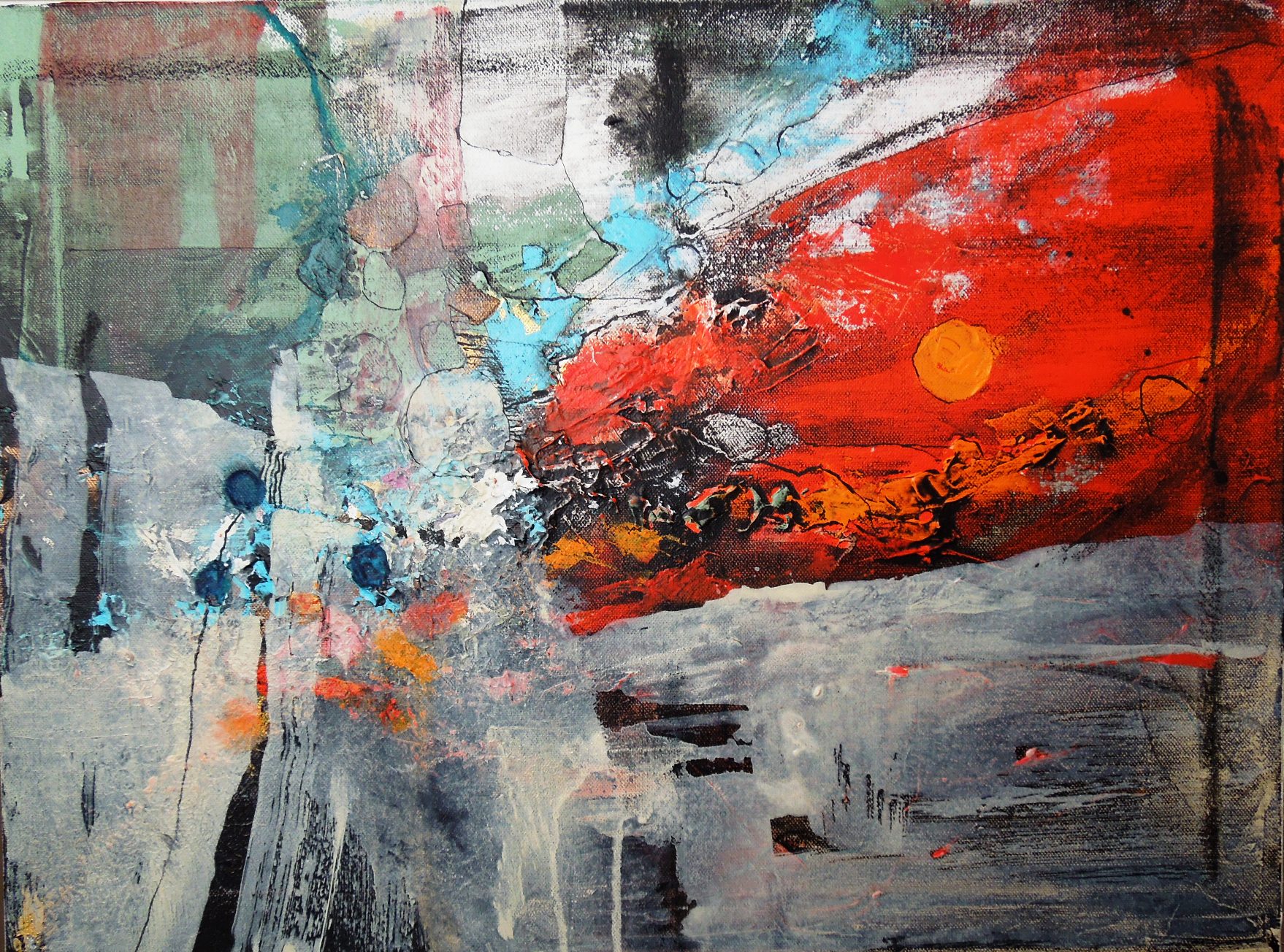
Above – Painting by Lee Krasner, titled The Seasons, oil and house paint on canvas,  approx. 92″x 203″ 1957 Whitney Museum of American Art, NY

Yesterday we attended a member preview of the highly acclaimed Denver Art Museum show titled WOMEN OF ABSTRACT EXPRESSIONISM. These brave and innovative women of the 40’s, 50’s and 60’s are my heroes, having charted the direction I would later choose to follow with my art. I did not make that phenomenal association until years later, because the emphasis and the credit was placed upon male artists.

As a dedicated student of fine art in the 60’s at the U of Colorado, Boulder I found myself artistically immersed and influenced during historically volatile times on a campus known for its politically active student body and its cutting-edge art department, among other fine attributes.  By the 60’s the world was rapidly changing, across the board, on all fronts, from religion to civil rights to politics to art, music and literature…

I was inside the momentous flux, historically, geographically, and creatively, in one of the right places to be at just the right time. The art world was evolving at an especially stunning pace; morphing; reinventing; branching off into new vocabularies of expression as art is expected to do when worldly conventions are spinning and older ideas are challenged. Those cutting-edge professors were learning and absorbing right along with students….we were all in it together, but few influential women artists were ever acknowledged or mentioned. If you were a young female artist of that time, that was the elephant in every studio and classroom. The world of art was dominated by men. I was one of less than a handful of women in the expressionistic painting classes where this stimulating, intoxicating new artistic action was happening.

I was vaguely aware of names like Helen Frankenthaler, Lee Krasner (the wife of Jackson Pollock), Elaine De Kooning (wife of William), Judith Godwin, Ethel Schwabacher and the others included in this current show. These women were already  painting their hearts out in NYC and SF, often sharing studio space with their prominent husbands. In the words of Lee Krasner, “I was always going to be Mrs. Jackson Pollock – that’s a matter of fact – but I painted before Pollock, during Pollock, after Pollock.”

Fresh approaches, bold brush stroke gestures and odd new vocabularies of expression ran rampant in these womens’ art, if one cared to look. Helen Frankenthaler said it best: “One of the first rules is NO rules.” In the words of the museum, “While individual expression is key, several themes recur in works by the women artists seen in this show. These include responses to place, the seasons, time of day, meaningful events, and literature, dance or music. These paintings are almost always quite abstract, even when referencing something real. The true subject is never the thing, but the painterly expression itself.”

Quoting now from the Curator of Modern Art, Gwen F. Chanzit, Ph. D at this Denver show:

“…they helped forge the first fully American modern art movement. While there is no one prescribed style, Abstract Expressionist canvases are known for loose brushwork all-over composition, an emphasis on surface rather than depth, and a grand sense of scale. Artists experimented with process and materials to free themselves from previous conventions.”

My love for mixed media and collage art found its origin with the experimentation of these women and the larger abstract movement to which they belonged. Bits of string, tin foil and various papers chosen for their texture or pattern can be found, worked with paint, on the canvases of this show. If I ever needed validation, and that need is by definition part of being an abstract artist, I found it in the work of these women. For them abstract expressionism was risky and unheard of; for me it is the norm. The art of these women has been underreported and undervalued, although they participated alongside men – even husbands! – in studios, art clubs, exhibitions and shows.

The art displayed in this show is so alive with the joy of painting free that it almost brings tears to your eyes. The powerful colors, the textures and the wide open gestures and brushstrokes are screaming freedom – from conventional traditional style and conformity. Seeing it all was a lesson, loud and clear, in being brave, in being a risk-taker, in being unrestrained and fully expressive as an artist. These women were gutsy broads!

If any of you have potential artists in your family or circle of friends, especially girls, remember that women of astounding talent were often ignored, brushed off, undervalued and cast aside as irrelevant. It still happens…..but less consistently.

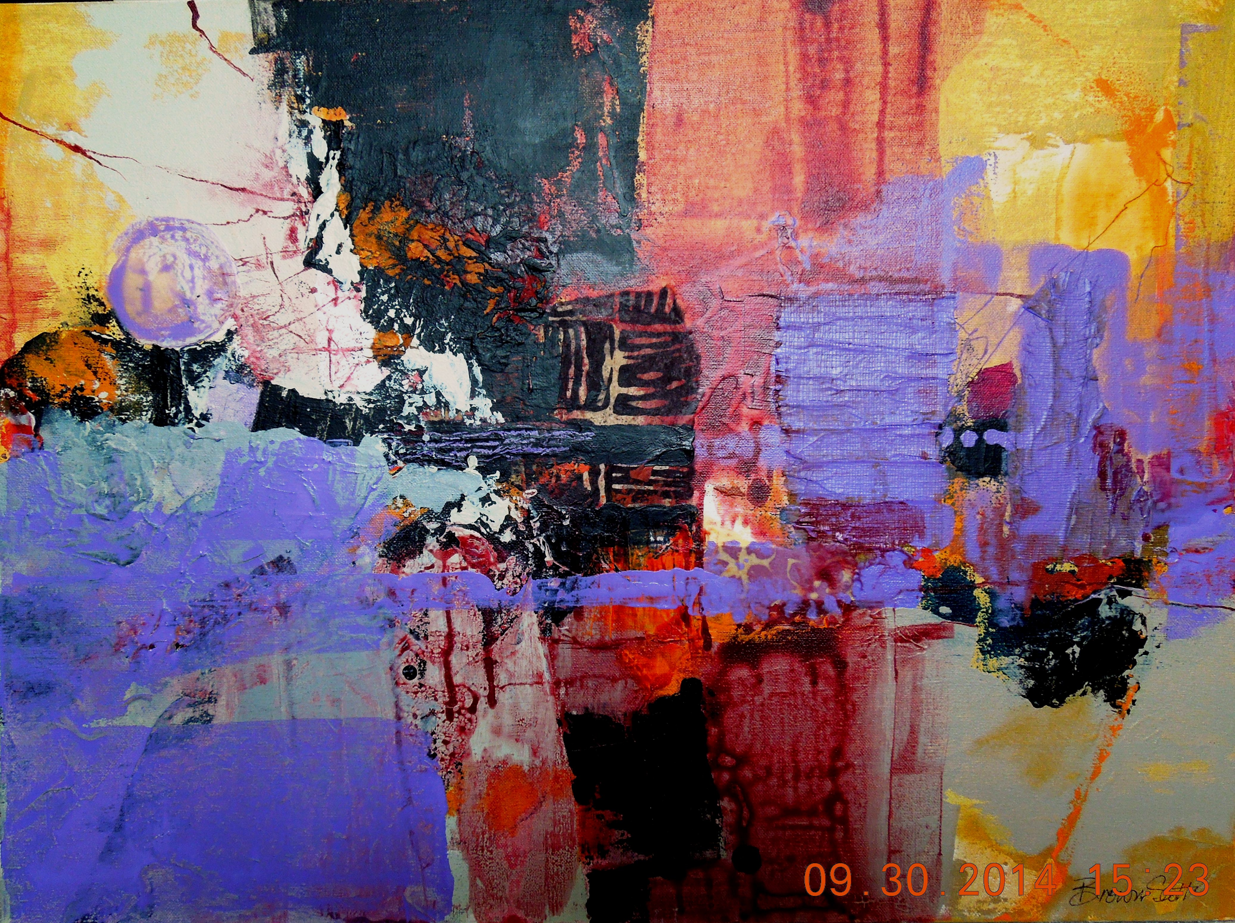
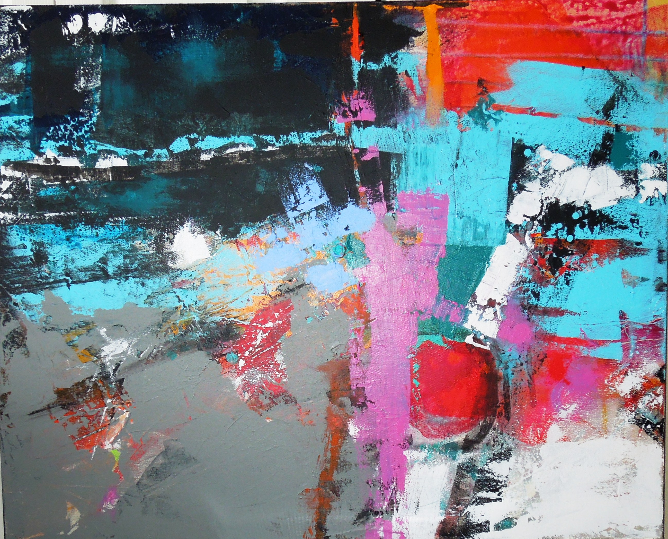
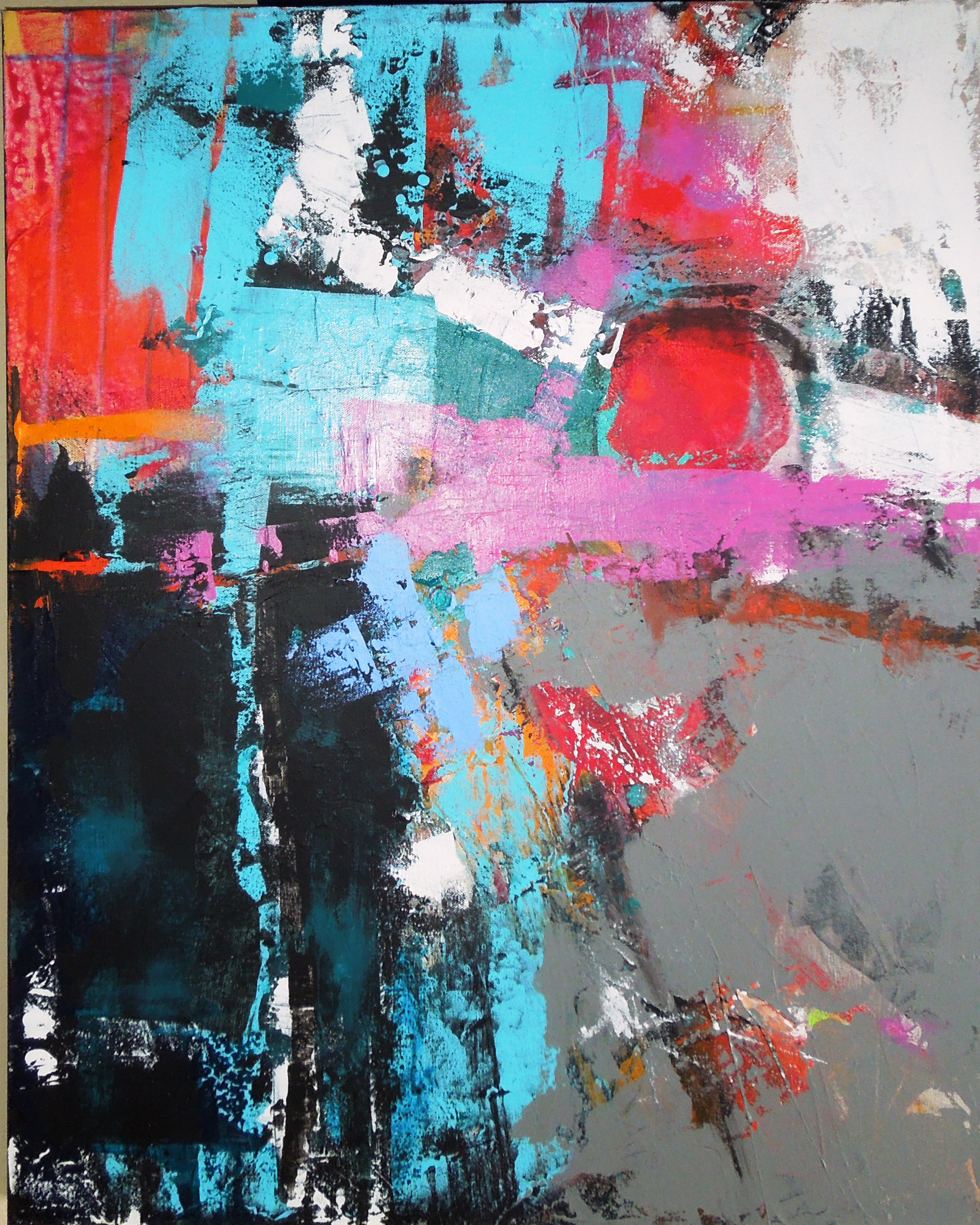
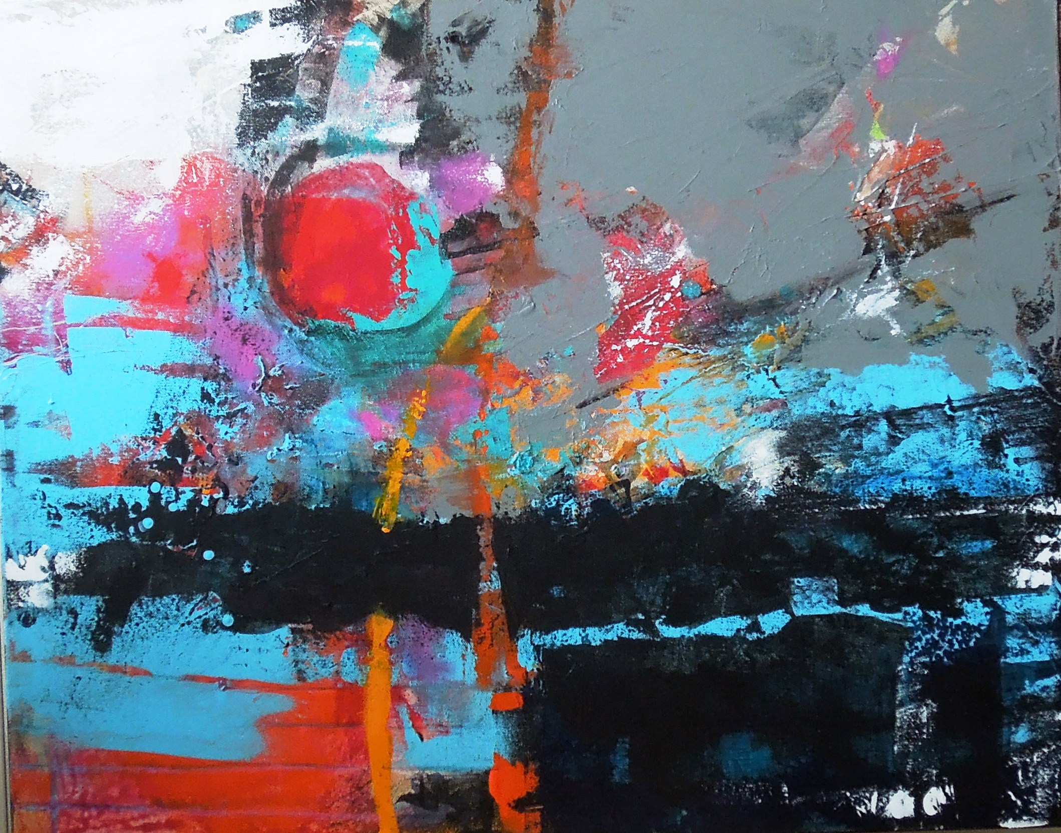
Thanks to the Denver Art Museum for allowing photos to be taken, and for the quotes I have used here.

Jo Ann Brown-Scott – new novel titled A CANARY FLIES THE CANYON, about the life of a young woman who finds her life’s passion in art

http://www.acanaryfliesthecanyon.com   http://joannbrownscottauthor.com

Instagram, Facebook, Twitter

Advertisement

The Anticipation of Travel

MalaysiaDusk   BangkokMoon

Malaysian Dusk  and  Bangkok Moon, mixed media by Jo Ann Brown-Scott copyright 2015

You know how I feel about creativity and stoking the fires to keep it smoldering – always awarding yourself with fresh experiences – feeding the creativity beast gourmet delights so that it will return to your work table and want to spend time with you. Travel is,  to me, one of the finest sources of creative stimulation. Travel is a luxury we can all afford if you define it as a departure from your normal routine that takes you out and away from your home headquarters. Therefore a trip down the block is travel, an excursion to a nearby city is travel, even a hike in the woods or watching a movie is a version of travel. You just need to get out of your own mind for awhile and experience new visual surroundings. I do all of that and more…..it is part of my job description as an artist and writer.

But this time I am headed to more distant horizons. I am traveling to the far regions of southeast Asia – Singapore in fact – for the second time, and my side trip during this trip will be to Siem Reap, Cambodia for three nights to visit Angkor Wat. I am traveling with a dear friend, also an artist, so I am going to experience double happiness. We will stay with my daughter and her husband who live in Singapore ( http://www.compassandcamera.com ) and therefore we will have a resident guide for every move we make, and we will be making some major moves.

I will love seeing Singapore again through my friend’s eyes – the spectacular cutting-edge architecture, the glitz and sparkle of the immaculate, well-mannered Singapore, along with its quaint and colorful shop houses in the older sections of Chinatown, Arab Street and Little India. Then on to the massive ruins of Angkor Wat , one of the ancient wonders of our world, now overgrown with gnarled tree roots and steeped in mystery. This is my favorite vacation contrast – the precious against the poor – the opulent compared to the common. It rounds everything out and gives you a conscientious balance. It jolts your senses and keeps you humble, seeing what has gone long before and what is happening now. You can’t have one without the other.

Creatively speaking, this makes for a rare and wonderful experience. The last time I traveled to Singapore I came home and painted a body of work based upon my  trip, capturing my visual, sensory, auditory and olfactory impressions of how it felt to be there. I was on such sensory overload that I could not sleep. Remembering the sights, smells, noise and food aromas of just the wild and wonderful Chatachak Market in Bangkok, for instance, fed my creativity for days on end.

Travel is the closest we can get, as human beings here in the 21st century, to time travel as it is explained by physicists and scientists  – living backwards or forward in time, almost in a parallel universe to our own and finding it remarkably exotic and foreign to your senses. Yet confined to this one planet. The big blue one. I highly recommend it for your enlightenment, your creativity and your fun.

The Year Long Canvas reaches her one-year mark!

?????????? ?????????? 

?????????? ??????????

The Year Long Canvas has had several major changes today, and you can compare them with the previous version below, as well as with the very first start of the original painting from a year ago. I worked the new additions to the composition from all sides today and offered all four orientations of her for your review. You can zzzzzoom in and see her texture – not quite as thick as I had imagined it would be at her first year anniversary.

This project might not be 100% finished at this point. If I look at this painting long enough I will always see something I would like to change…it is a sickness…never being satisfied. But perhaps my fatigue with the entire project will prevent any further work. I cannot say that this newest version is my favorite of all the stages of the past year, but it is certainly among the top three. It has indeed been an exercise in patience, perseverance, dissatisfaction and approval, unease and comfortable-ness with my own work. If the lesson to be learned was that I should trust myself more, that has been accomplished. I was at times discouraged that I would ever be able to make a whole new painting over the top of many other incarnations, but I did it, over and over.

My son says this painting reminds him of RIO – a landscape in other words if it is placed horizontally. It does not remind me of Rio, but it does speak to me of action, energy, optimism and fun. So maybe it is RIO after all! I cannot decide which orientation I prefer…I really do not care at this point. I just like the color, texture and pattern of it, and most definitely color is the thing that grabs people first, then maybe the dramatic composition. The sensuality of color is usually what most people respond to in art and try as I do sometimes I cannot do quiet neutrality. It bores me to tears.

I have had a great year with this project and I hope you have too! Phew…I think we almost made it. Thanks for hangin’ in there!

??????????  newclass 004

Previous version on the left and the very beginning of it last March on the right.

Being Creative

??????????   ??????????

Paintings #1 and #2, not yet titled, copyright 2015 Jo Ann Brown Scott

There is something about a snowy, extra icy day that fires up my creativity. The sidewalks are a sheet of ice, the temps have plummeted from yesterday, there is thick, cotton gauze fog and no one who has a choice would be outside. And so we paint, me and my creativity. The light is perfect – bright with the outdoor whiteness, but no sun glare, no reflections in my north facing window. I always say that my most ideal conditions in which to paint, or write, are simply a good night’s sleep and a day when I don’t have to go anywhere or do anything.

I rolled out of bed about 8 am, a little late for me, went directly to the kitchen and made my famous chicken broccoli soup, eliminating any distractions about what I am going to eat today. It’s on the stove simmering, crusty Asiago bread nearby. This must be heaven.

As any artist is bound to do from time to time, I sometimes wish that I could paint a different way. It happens to the best of us; it is born not of boredom with what we are used to doing but a challenge to ourselves to accomplish a whole new look and make it sing, as if we had been doing it forever, just to prove we can. Every once in a while I give it a try. I usually paint with a confetti riot of color, and so my reaction against that tendency is to paint with a greatly subdued palette and far less action. That does not truly represent my normal joyful state of mind, (happy!) but I do have more subdued reflective moments of silence (yawn…) when I become rather meditative (almost asleep). If I can tap into that while I am standing upright painting, occasionally I get some fine results. If I try to do it twice,  I can, but I don’t necessarily like to, and I fall back into the fun stuff of going bananas with color; it seems to be the authentic me.

The second painting is subdued, for me. My version of restraint. (perhaps you are laughing now, at my version of restraint) but I kept it simple, the colors are there but not so plentiful and/or not so in your face. I wanted to do more, but I decided to eat lunch instead and let it go for a while and see if I can live with it the way it is.

With this blog I have two photos, the first abstract painting is a new one displaying my customary  expressionistic (controlled color pattern texture chaos) type of composition, and the next a much more toned down piece where as I worked I kept a lid on it. Over the holidays when I had some fun relatives over for lunch, my six year old niece, Finley, (with whom I  sometimes paint, and who calls me Great Jo because I am her great aunt) walked into my studio, saw the toned down painting on my work table and said to me, “Great Jo, this one is not finished – can I finish it for you?” Believe me, it was tempting to see what might have happened. I will file that idea away; and another time I will start something and let her finish it. It has to be a cut above elephants who paint, right?

By the way, yes it is a new year and I have not forgotten about the YEAR LONG CANVAS – she is looking longingly in my direction as we speak, jealous of my other work. She needs a fix, another session, and I will get to her soon. She reaches her one year “time up” about March 1st, and here we are in mid-January already. I have plans for the entire month of February, so my time is becoming scarce leading into her birthday. My next post will be for her, as she nears completion.


November Version of the YEAR LONG CANVAS

??????????

YLC November, copyright 2014 Jo Ann Brown-Scott

What nine months of attention does for an embryo, forty early mornings will do for your gradually growing wholeness….Your intelligence is marvelously intimate. It’s not in front of you or behind, or to the left or the right. – Rumi

Hello everybody! Here we are well into November and as I woke this morning I was in a great frame of mind due to absolutely nothing in particular. I had not even slept well, but something lit a little fire in me. After a long, crisp walk in the morning air the time was right; I was ready to apply the latest shock therapy to the canvas. The additional changes just happened, in less than fifteen minutes, to the Year Long Canvas that Homare Ikeda offered to me as a challenge and an assignment way back in March of this year. I would say we are in the home stretch now, but who ever knows when it will be done, or mostly done, or perhaps even continue? For those of you arriving late to this project, the objective is to continue to paint for a solid year on one particular canvas, adding layers and layers of new work on top of the old. It is an exercise in patience, confidence, acceptance of change, and testing one’s ability to focus over a long period of time on one constantly changing image. Of course I am painting other canvases as well, and finishing them, because I have a tendency to be quite task oriented. I like a feeling of accomplishment.

If you compare this version to the others in my blog archives about the YLC you will see that I am letting myself go more with each passing month, slinging the paint around with more abandon, opening my heart to more drastic change and actually having more fun with it than I did in the beginning. My loose and free-spirited attitude is picking up speed as I work through the months. I barely even try anymore – I just work mindlessly. It is my arm but something else is guiding me. I feel it arriving from over my shoulder, it comes through me and lands on the canvas. It is as if I am not even here. I am just an instrument. I do believe I am in the flow.

Obviously I use layers of paint both thick and thin, building texture and depth, a characteristic color palette that I enjoy, a linear emphasis, a roundness in some area, darks against lights and lights against darks. I am working vertically right now, but it started out being horizontal; I work all around it, turning it in all orientations as I paint, because in abstract art you have to do that. You might choose to see the suggestion of a landscape, or not. Purely abstract is fine too.

This painting could quite easily go in the direction of enormous simplicity and minimalism, by covering up almost 90% of the composition with washes of gray, black or even white, allowing just slivers and shafts of colors to reveal themselves as if you are looking through an opening to something underneath. That seems to me a rather easy, chicken way to end the whole thing.

I actually prefer the challenge of complexity, depth and mystery. But you probably already knew that by now.


When You Want to Sell Art…get real

notations      lace 002

Both are 20″x60″ mixed media panels using paint, exotic papers and polished stones – zoom in and see detail

by Jo Ann Brown-Scott, copyright 2014

Ok let’s get practical – whether I am an artist, a musician, a writer, a cook or a candlestick maker, as the fairy tale goes, I would very much like to sell my art. I know, however, that I can’t count on consistent, regular money coming in from my art sales. So I have other sources of income…and/or I do various types of artwork so that I will appeal to a wider audience.

I would love to be able to do abstract expressionistic paintings for the rest of my life and sell them like intellectual hotcakes to the more finely tuned collectors who are authentic followers; those who understand and appreciate the style and know the excellent from the nondescript in the world of abstraction. Those folks are few and far between. Unless you get really lucky and you are an extremely hot property, quite gifted and have either the tenacity of an artistic pitbull or the ability to be in exactly the right place at the right time while hob-knobbing with the  movers and shakers, you will not make it huge in the abstract expressionist movement. Doing so would be the equivalent of being a star athlete, a mega movie star or a best selling author who literally owns real estate on the New York Times best seller list. Slim to none. Pipe dreams. Get real.

Of course I am more than happy to sell an abstract piece whenever I can no matter how sporadically it comes my way.

In the meantime, I paint, create and even construct other art that is more commercial, more marketable, simpler, more design oriented and way trendier, less expensive and just fun to have hanging in your tastefully decorated home. I have taught Interior Design, so I have to admit that I get turned on by a lovely home – especially if it is eclectic and has a well diversified collection of furniture, art, antiques, rugs, pottery, books, and some funky found objects. And most people’s homes, these days, are eclectic, because we travel and bring exotic treasures home, we receive expensive gifts from friends, we love second hand stores and thrift shops, we buy neat things from Pottery Barn and it all has to coordinate nicely into a home space. So I create my more commercial pieces of artwork with several things in mind, knowing that they will compliment many different kinds of homes.

Therefor I have to keep current on whatever trends are currently trending. The most popular paint colors. The newer fabrics that are being shown. The patterns of area rugs. The furniture styles….and the kinds of art that are selling to people who are not necessarily art intellectuals but still enjoy having a stunning home. No matter what your style of choice is at this very moment, and no matter what your tastes are forever, chances are you are always on the hunt for a great new item for your home that will make it unique and reflective of who you are.

The photos I have included are some examples of the more commercial artwork I am doing. They are all one of a kind pieces, unique and certainly not mass produced, but labored over and created with heart and soul. Prices range from $600 up….

redbarn Red Barn abstraction

pod Seed Pod


Year Long Canvas Week # 10 – Reprieve

snow SNOW DAY

The YLC has had nothing new added since last week due to a freakish spring SNOWSTORM in the Denver area and the mountains, making a commute into the city for Monday art class a crazy idea even for me. It was freezing cold; the snow kept coming down, and what began as a slushy rain on Saturday turned more syrupy and thick and then serious by Sunday. On Monday morning it had snowed all night, gotten much colder and morphed into black ice on the highways and a total accumulation of about 7 inches south of Denver where I live and 24-36 inches in the foothills and higher country. The skiers are nuts with joy; the highways up to ski altitudes are clogged with people ditching work and Arapahoe Basin will stay open until June, they have announced. Here where I live, today is better with just cloudy skies, temps in the 50;s and snow nicely melting off all roads. By the weekend we’ll be into the low 80’s.

Oh I know, I could have worked on the YLC at home, but I like to “do her” during class because the energy is so palpable and positive you could cut it with a knife in that classroom. But I also, yes I do, I really really do, like her so well the way she is that I used the “snow day” excuse to give her a reprieve until next week’s class. That’s legal and I made an executive decision to let her rest. I need to think and carefully calculate what will happen to her next.

I actually spent the snow day re-working an old 18×24 inch canvas that I had stored in a closet, and I am pleased with what happened. Often the best work I do is giving life-support to old compositions that I became so disgusted with at some point that I shoved them away into a closet, letting them rest and slip into an intentionally induced art coma. Not as punishment but to give us both a time out, allowing frustrations to settle down. Taking them out, months later, breathing oxygen into them and seeing them with new eyes is usually worth the effort. So yesterday I did that and the attached photo is the finished composition.

?????????? Mixed Media painting titled WHEN IT ALL COMES DOWN, copyright 2014, Jo Ann Brown-Scott

This painting surprised me. The places that are re-worked and covered up with new ideas amount to about 3/4 of the finished image. Only the orange area is original and untouched. The decision was what to cover up and what to enhance, as is usually the case. If you zoom in you will see that there are some shapes delineated with black ink, almost like boulders and stones falling. The orange area has a definite sun, and a sunset type of glow. You might choose to interpret this as a literal landscape with some kind of rockslide and a sun setting above a horizon but that would be the easy way out.

I prefer to think of it as a slide, a break, a tumble of some “LIFE” issues happening in a chaotic rush of action placed in contrast with the permanence of the sun rising and falling every 24 hours in a constant and reassuring event that tells us all that some things never change. The sun will come and go, regularly alerting us that life goes on. Thus the title – WHEN IT ALL COMES DOWN, life continues and hope endures. That’s my story on this one.


Year Long Canvas Project, Week #9 – Risk Taking

her2 Before – some gray wash added in the lower area

??????????  After  – more gray wash and the big gutsy move, copyright 2014


My relationship with the Year Long Canvas (YLC) continues, and she has a mind of her own…so when she speaks to me I listen.

Monday’s class was rather different and fascinating for me.  At the suggestion of my instructor, Homare Ikeda, I reluctantly covered a large portion of the lower portion of the painting with a gray wash. He loves gray washes – he uses them a lot in his own work. In the hallway outside our classroom is hanging about a 4ft x 4 ft Ikeda painting, and there is a large gray square area in the middle of the painting that dominates – obviously at some point he thought the painting would look better and work better and be more balanced if he grayed-out this portion of the composition. I cannot show you a picture of it because I would be violating his copyright, but the remainder of the painting is busy – complicated and playful – with zigzags, polka dots, squiggles and other childlike gestures done in various colors of paint. The gray area is not the focal point – it throws the emphasis to all the outside areas of the painting which are the focal point. Very unorthodox, to do that – but that is typical Homare Ikeda. That is precisely why he is who he is. See his paintings at http://www.homareikeda.com

So, we agreed it was time to simplify, and what has become the focal point and/or the STRENGTH of the painting (the multi-colored busy-ness in the middle area of the right side of the painting) is NOT the place to do that, so it seemed logical to use the wash right where I used it. Painting is often a series of additions and subtractions – you try something on the canvas and either it enhances the painting or it does not. And it might enhance the painting during many hours of work sessions and then suddenly when you do some specific thing to the other parts of the painting, everything changes and the area you enhanced no longer enhances. After cautiously spreading the gray wash over the bottom, I liked it – it made everything else stand out by comparison and it concentrated all the action more effectively on the focal point. So I continued the gray wash farther up the left area of the canvas, covering up even a larger percentage of the canvas with it. The purplish-blue in the upper left was grayed as well. Then I decided I liked the  path of stark white so I whitened it up even more – taking it more prominently from lower left across and over toward the mid-right, which gave the focal area more punch, because the white contrasted so nicely with all the bright colors there.

I was surprising myself – I was going forward with something I thought I would not really like and finding out it made everything better. Gray is not a fav color of mine, but it did what it was supposed to do because it is so neutral. The advantage of gray is that it does not conflict with much. It is merely gray.

So while I was on a roll I decided to create a sort of something-or-other to look THROUGH, right on top and over the surface of the focal point, as if you are seeing all that focal point action behind it  – and instead of doing an obvious window with a square-ish frame I decided to do a series of slanted parallel lines almost suggestive of venetian blinds, right over the top of the focal point – the reason being to give it more importance! Anyone viewing the painting would feel that they were seeing through the lines to a special scene or image – and since it already had a round sort of blurred fried egg shape like a sun, perhaps I was suggesting that the view was of a landscape with a colorful hillside village underneath the sun, seen from behind open venetian  shades. I thought it might give the painting a quirky twist – a mysterious turn of events.

Well it seemed a risk worth talking, so I used turquoise lines in a non-square-ish, somewhat distorted way, and I drew them right on top of my focal point. YIKES YIKES YIKES I kept thinking as I did it – this is either going to be great or it is soooo not going to be great.

When I showed it to Homare he was very, very pleased – big smile. And my work for the day was done.

I would so love to leave the YLC this way and call her done….I would title her “Seeing Puerto Vallarta” …… but that is not the challenge, is it?

Year Long Canvas Project #7 – Time for a Bold Move

721class  before   orange  after

Yesterday afternoon was gorgeous outside – spring in all of its SPRINGY glory. I wanted to take a walk and go play in the out of doors. But I attended my usual Monday art class. When I arrived I can’t say that I was really into a painting mood, but I know from experience that when your mind is NOT fully engaged and you are thinking about other things, it can actually work to your advantage. You don’t over-think – you don’t question yourself – you have kind of a WTF attitude. That can bring a looser approach and a less contrived work session. But in spite of that mood, class was stimulating, energy sapping and intense – but in a good way. Some students were painting for upcoming shows. Some were painting the same kinds of things they have been painting for months now with little variation. Others were doing fascinating work that I greatly admire. A few were barely painting at all…

In some future post I will talk about the situation in an art class, any art class, which predictably involves some students who aspire to paint as precisely like the instructor as they can – they want to be clones. They do not or cannot bring an original idea or concept to the table. (On second thought I will just leave it at that, because I don’t ever want to make a habit of bashing other people’s work…)

I set up camp. I am working on 3 canvases now at the same time, but the Year Long canvas has gained a reputation and people now know it by name, and they stop by to visit HER each week, checking on progress. I am assigning it a gender now, don’t ask me why. I just don’t like calling the canvas an “IT”. The first photo at the top of this post is how the canvas looked at the mid-point of yesterday’s class, with new work done in several areas. The changes made include the subtle definition of oval shapes in the upper right with a wash of pale peach tones and in the center area I defined 3 oval shapes in the Naples yellow, then another larger oval to the left of that. Why? Because it was time to begin some definition…some type of direction defined by shapes. No, I do not know where I am going with it just yet. Then I whitened up the slash of white that runs from the lower left across the center toward the upper right. I also added more purple tones to the upper left area, overlapped some areas with additional turquoise. I am improvising – abstract expressionism is all about improvisation. The paint does speak to you – it tells you what to do next. You learn to read what the paint has said, either in its texture, tone, shade, shape, color, or line.

At that point my instructor stopped by to offer his input. I told him I felt that the painting needed some type of bold move – a big jolt – for these reasons:

1) the art needs something unpredictable and incongruent to shake things up within the whole

2) I need to give myself something brand new to deal with, because of course adding a thing like that immediately effects everything else, and it keeps me from getting bored by offering me a self-imposed problem to work through

3) a bold change would contribute greater sophistication, an element of surprise, eccentricity and complexity if it is used effectively

4) ultimately the goal would be to take the composition from mediocrity and predictability toward  excellence and individuality

He totally agreed. He said it was time. I suggested a large area of flat, unapologetic strong color. Orange in fact, because there is already a bit of orange splashed around the composition. He liked that choice. I also said I wanted the area of orange to be placed in the lower right quadrant of the composition – he agreed. He and I talked….he threw out some additional ideas and I did too. He and I discussed the challenge of the 365 days  ahead of me – and the probability that nearing year’s end the paint will have gotten so thick that it inhibits the artist’s options. For instance perhaps you want to make a line, for direction and emphasis, which I actually love to do, and yet you cannot do that because the surface has gotten too bumpy with paint buildup that you cannot create a convincing straight line. So you have to adjust to that, as well as a lot of other things. I am only into month 2 as of this writing. Can I do this? Do I really WANT to do this? What is it going to get me, in the  long run? I have had so damn many “character building” experiences in my life – do I need this too? I hope it doesn’t sour me on painting as it builds up my character. I don’t want the art to become a chore.

You see the “before” and the  “after” – remember it is just a start of orange.

I really like it, but it is not a big enough change for my taste, so I may decide to enlarge the orange a bit more or honor and enhance a second area with it’s presence.


The Divine Madness of Abstract Art

spray1   spray2

Have you ever watched a painter of abstract art actually paint? The artistic process is as exacting, as agonizing as is traditional, representational art – in the skin of a totally different animal.

If you walked into a roomful of abstract expressionist artists at work and stayed awhile, feeling the energy, listening to the often audible, agonizing utterance over a disappointing gesture on the canvas, hearing the constructive but critical comments from the instructor about an area so small that for the average viewer it would go unnoticed in the whole, or the occasional gasp from a painter who has been pleasantly (or unpleasantly) surprised over a result on the canvas when the paint did exactly what the paint wanted to do, your eyes and ears would be opened to a process that is divine in its madness and perfect in its imperfection. I believe that successful abstract painting requires from the artist an eccentric vision, curiosity about what ESSENCE really is, faith in the journey of the process and a free, confident spirit willing to invite adventure and improvisation, to name just a few. There are many more. I could go on.

One Christmas my daughter slipped into my stocking the ideal solution to all of the centuries old misunderstanding of abstract art – a peppermint flavored breath spray, small enough to always be available but discreetly hidden in any pocket,  that gives a person instant understanding of Modern Art!! Who knew? The back of the packaging has powerful testimonials from cherished customers who insist that they became instant, educated art critics with just one quick and easy pump of the atomizer.

Of course I was not the one who needed it – but she knew that I would run across many who did need it and so I carry it with me all the time. Yes it gets a lot of laughs, and always a select few who look at me incredulously, eyes searching for clues, wondering if….perhaps….

I wish I could tell you where to find these; they are probably jumping off the shelves.

Know anyone who needs a spritz? Line forming fast to the right….